The Grid
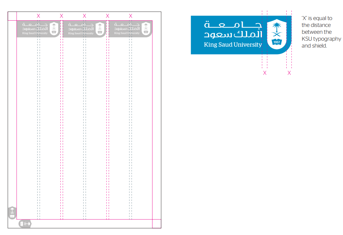
For document layouts, we have developed a consistent yet flexible grid for placement of titles, sub titles and graphic elements to be used on all King Saud University communications.
The KSU grid is comprised of 3 main columns—each being equal to the width of the KSU logo. Gutters (internal margins) are based on an ‘X’ value , ‘X’ being equal to the space between the KSU typography and shield in the KSU logo.
Page margins are equal to the width of the shield in the KSU logo.